
Fourteen Design Concepts Worth Understanding Before You Redecorate
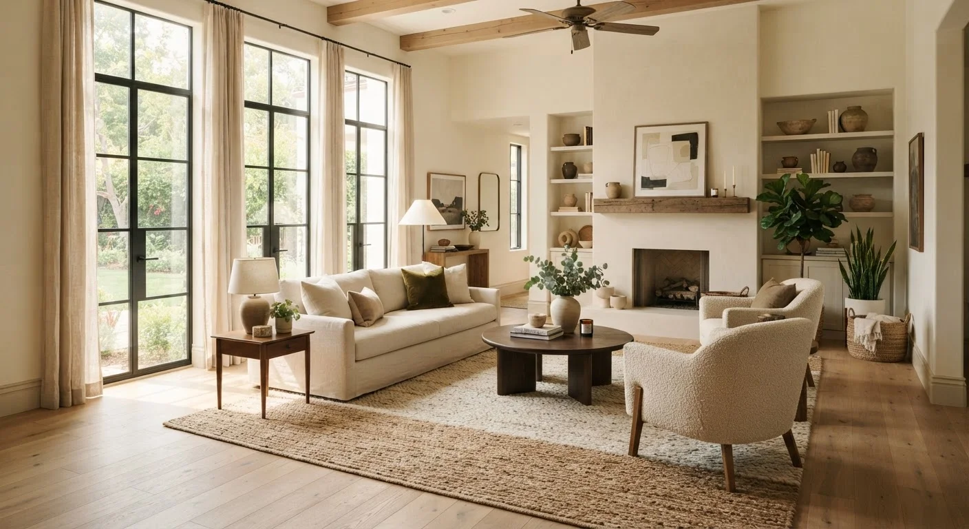
Photo credit: faqsnest.com
In this article
From negative space to visual weight, these are the concepts that separate intentional decorating from expensive guesswork.
Key Takeaways
- Negative space is an active design tool, not wasted room — it gives the eye a place to rest.
- Visual weight determines how furniture and décor feel balanced, even without a measuring tape.
- Scale and proportion are distinct concepts that work together to prevent rooms from feeling off.
- Rhythm, repetition, and contrast are what make a room feel dynamic rather than flat or chaotic.
- Understanding undertones in color prevents mismatched walls, furniture, and textiles.
- Design concepts apply regardless of budget — they shape how you use what you already own.
Why concepts matter more than trends
Redecorating without a conceptual foundation often leads to rooms that look assembled rather than designed — pieces bought individually that never quite speak to each other. Understanding a handful of core design concepts won't limit your creativity; it will sharpen your instincts so that every decision you make has a reason behind it.
These aren't rules handed down from design schools. They're observations about how people perceive space, light, and color — patterns that professional designers use to solve real problems in real rooms. Once you recognize them, you'll start seeing your own space differently. Our comprehensive design guide puts all of these concepts in context from layout through finishing touches.
The fourteen concepts below are arranged to build on one another. Start at the beginning, or jump to whichever one describes a problem you're already trying to solve.
Negative space
Negative space is the empty area surrounding objects — the wall behind a shelf, the floor around a sofa, the gap between two lamps. It isn't wasted room; it's an active compositional element that lets the eye rest and helps featured pieces stand out. Overcrowding a room eliminates negative space and creates visual fatigue. When a room feels busy or chaotic, removing elements is often more effective than rearranging them.
Removing elements is often more effective than rearranging them.
Visual weight
Visual weight describes how heavy or dominant an object appears, independent of its actual mass. Dark colors, rough textures, large patterns, and solid forms carry more visual weight than light colors, smooth surfaces, small patterns, and open frames. Distributing visual weight evenly across a room — not just symmetrically — is what creates a sense of balance. A single dark armchair can anchor an entire corner.
Distributing visual weight evenly across a room creates a genuine sense of balance.
Scale vs. proportion
Scale refers to the size of an object relative to the room itself. Proportion refers to the size relationships between objects. A sofa can be correctly scaled to a large living room but poorly proportioned to the coffee table in front of it. Both matter independently. The most common scale error is furniture that is too small for the space — which makes rooms feel sparse — while the most common proportion error is a rug that doesn't extend under enough of the furniture grouping.
Scale relates to the room; proportion relates to how objects relate to each other.
The focal point
Every well-designed room has a focal point — a primary visual anchor the eye moves toward first. It might be an architectural feature like a fireplace, a large window with a view, or a deliberately composed wall. When a room lacks a focal point, it tends to feel unsettled. When it has too many competing focal points, it feels busy. Identifying and reinforcing one clear focal point per room is one of the fastest ways to give a space intention.
A clear focal point gives a room visual intention and a sense of arrival.
Color undertones
Every paint color, fabric, and wood finish has an undertone — a subtle secondary hue that emerges in different lighting conditions. A white can read pink, green, or blue depending on its undertone and the light source. Clashing undertones — a warm-toned wood floor paired with a cool-gray wall — are one of the most common reasons a room feels slightly off even when individual choices seem sound. Always evaluate colors in the room's actual light, not in a store or on a screen.
Clashing undertones explain why rooms feel off even when individual choices seem right.
The 60-30-10 color rule
This is a practical guideline for distributing color in a room: 60% dominant color (usually walls or large upholstery), 30% secondary color (drapes, accent furniture, or rugs), and 10% accent color (cushions, artwork, small objects). The ratio creates variety without visual noise. It isn't a rigid formula — some rooms work beautifully with two tones and a neutral — but it's a useful starting point when building a palette from scratch.
The 60-30-10 rule gives color variety without creating visual noise.
Rhythm and repetition
Rhythm in design is achieved by repeating elements — a color, a shape, a texture — at intervals throughout a room. Repetition creates visual coherence and guides the eye around a space in a satisfying way. This is why a throw pillow that picks up a color from a painting or a rug feels intentional: it creates a rhythm between otherwise separate objects. Without any repetition, a room can feel like a collection of unrelated purchases.
Repeating a color or shape at intervals turns separate objects into a cohesive composition.
Contrast
Contrast is the deliberate pairing of opposing elements — light and dark, rough and smooth, curved and angular — to create visual interest and prevent a room from feeling flat. A room that is entirely soft, neutral, and rounded can feel bland. Adding a single matte-black frame, an angular side table, or a deeply textured throw introduces contrast that energizes the space. The goal isn't drama for its own sake, but enough variation to keep the eye engaged.
Enough contrast keeps the eye engaged; too little and even beautiful rooms feel flat.
Texture layering
Texture affects how a room feels before anyone sits or touches anything — visually, surfaces with texture appear warmer, deeper, and more inviting than flat, smooth ones. Layering textures means combining materials with different tactile qualities: linen alongside leather, a jute rug beneath a wool throw, a rough stone lamp base next to a polished side table. This is especially effective in rooms that use a limited or monochromatic color palette, where texture provides the variation that color cannot.
Texture layering is the designer's tool for adding depth to a restrained color palette.
Furniture traffic flow
Traffic flow refers to the path people naturally take through a room and whether furniture placement supports or obstructs it. A clear walkway of around 36 inches is a widely cited guideline for main paths, and around 18 inches between a sofa and coffee table is considered comfortable for most adults. Rooms that feel awkward to move through often have furniture pushed against walls in a way that leaves the center open but the perimeter blocked. Arranging furniture toward the center of a room often improves both flow and conversation.
Pulling furniture away from walls often improves both traffic flow and conversation.
Lighting layers
Relying on a single overhead fixture is one of the most common lighting mistakes in residential spaces. Effective room lighting typically combines three layers: ambient (general illumination), task (focused light for reading, cooking, or working), and accent (directional light that highlights art, architectural detail, or texture). Each layer serves a different purpose, and the ability to control them independently — through dimmers or separate switches — dramatically expands a room's range of mood and function.
Three lighting layers give a room far more range than a single overhead fixture ever can.
The line types in a room
Horizontal lines (long, low furniture, wide shelving) suggest rest and calm. Vertical lines (tall bookshelves, floor-to-ceiling drapes, high ceilings) suggest height, formality, and strength. Diagonal lines (staircases, angled furniture) create energy and movement. Curved lines (arched doorways, round tables, organic shapes) soften a space and feel more casual and welcoming. Most rooms work best with a dominant line type that reflects the intended mood, with supporting lines providing contrast.
The dominant line type in a room quietly shapes the mood before any color is chosen.
Odd-number groupings
Objects grouped in odd numbers — three candles, five picture frames, seven books — tend to feel more natural and visually interesting than even-numbered groupings. This is a well-established principle in both design and art composition. Even numbers create symmetry, which can feel formal or static; odd numbers force the eye to keep moving and create a more dynamic arrangement. It's a simple rule to apply to shelving, tablescapes, and gallery walls.
Odd-number groupings feel more dynamic because they keep the eye moving.
Design hierarchy
Design hierarchy is the principle that not everything in a room should compete for equal attention. Establish a clear order: what is the most important element (focal point), what supports it (secondary elements), and what fills in without demanding attention (background elements). When everything is equally emphasized — same scale, same contrast, same color saturation — nothing stands out and the room feels undifferentiated. Hierarchy is what separates a curated room from a crowded one. See how core design principles like balance, emphasis, and proportion work alongside hierarchy to make any room feel intentional.
When everything competes for equal attention, nothing stands out — hierarchy fixes this.
Putting it all together
None of these concepts demand expensive materials or a gut renovation. Most of what they ask is attention — to proportion before you buy, to undertones before you paint, to negative space before you fill it. If a room has been frustrating you, there's a good chance one of these fourteen ideas names exactly what's missing.
Start with observation, not shopping
Before buying anything new, spend time in your room at different times of day and note what bothers you. Most design problems have a conceptual name — and once you identify it, you can solve it precisely rather than speculatively. Buying your way toward a better room rarely works as well as understanding what the room actually needs.
The natural next step is applying these ideas room by room. Our room-by-room design checklist walks through layout, lighting, storage, and finishing details in a structured sequence. And if any of these concepts conflict with advice you've heard before, our article on interior design myths separates lasting principles from outdated assumptions.

Author
Home & Garden Editorial Team
Home & Garden Editorial Team is the collective byline for our editorial team and contributor network. Articles published under this byline or an editorial pen name are researched, written, and reviewed according to our editorial standards for clarity, consistency, and independence before publication.
View all articles →