
Interior Design Myths That Keep Rooms Looking Off
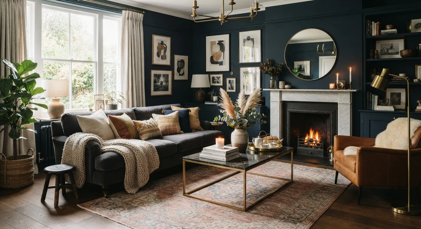
Photo credit: faqsnest.com
In this article
Dark paint shrinks a room? Mixing metals is wrong? We separate stubborn design myths from what actually shapes a space.
Key Takeaways
- Dark paint does not automatically shrink a room — it can actually add depth and intimacy.
- Mixing metals, patterns, and styles is acceptable when done with intentional cohesion.
- Furniture pushed against walls often makes rooms feel less spacious, not more.
- Matching furniture sets can create a flat, showroom look rather than a lived-in one.
- More light sources at lower wattage almost always beats one harsh overhead fixture.
- Rugs in small rooms can visually expand the space when sized and placed correctly.
Why Design Myths Persist
Interior design advice travels fast and loses nuance faster. A rule-of-thumb shared in a mid-century decorating manual gets repeated on social media, stripped of its context, and suddenly becomes received wisdom — even when the original guidance was specific to a particular era, room type, or budget constraint.
Most design myths survive because they feel logical on the surface. Dark colors absorb light, so of course they shrink a room. Metals have undertones, so of course they clash. These assumptions are plausible enough that few people stop to test them. The result is rooms that stay safe, stay flat, and never quite feel finished.
Understanding what actually shapes a space — proportion, light distribution, visual weight — is far more useful than any shortcut rule. For a grounded look at the real principles underneath, see our design principles guide.
Myth
Dark paint makes a room look smaller and should be avoided in compact spaces.
Fact
Dark paint can actually make a small room feel more intentional and intimate — poor scale and clutter are the real culprits behind a cramped feel.
Color absorbs light, but a room's perceived size is more directly influenced by furniture scale, ceiling height, and how well the lighting is layered. A small room painted in a deep, consistent tone — walls and ceiling together — can feel like a deliberate design choice rather than an accident. Contrast, clutter, and mismatched scale are what make rooms feel tight. If you're concerned about light levels, address the fixture count before you reconsider the paint chip.
Myth
Mixing metals (brass, nickel, black) in the same room looks unfinished and accidental.
Fact
Mixed metals read as intentional when one finish dominates and others appear as deliberate accents with a shared quality (all matte or all polished).
The rule against mixing metals arose from a time when hardware and fixtures came in uniform sets. Contemporary interiors regularly combine warm and cool metals because the contrast adds visual interest and avoids the sterile uniformity of a single finish throughout. The key is proportion: choose one metal to carry roughly 60–70% of the presence (faucets, cabinet pulls, light fixtures), and use secondary metals sparingly. Keeping all finishes in the same category — all matte, all polished — adds cohesion without uniformity.
Myth
All furniture should be pushed against the walls to maximize floor space.
Fact
Floating furniture away from walls and grouping it around a central anchor typically makes rooms feel more spacious and purposeful.
When every piece lines the perimeter, the center of the room becomes a void and the seating feels disconnected — more like a DMV waiting area than a living room. Pulling furniture into a cohesive grouping around a rug or focal point defines a zone, creates a sense of conversation, and allows the eye to move through the room rather than scan a bare middle. The open floor space around the grouping reads as intentional breathing room rather than empty acreage.
Myth
A matching furniture suite is the safest and most cohesive approach to furnishing a room.
Fact
Coordinated sets can look flat and showroom-like; mixing pieces of different origins and scales within a consistent palette creates more depth.
Furniture suites eliminate the guesswork of compatibility, but they also eliminate the visual tension that makes a room interesting. When every leg, finish, and proportion matches, there's no hierarchy, no discovery, and no sense that the room has a history. A more effective approach is to anchor a room with one or two substantial pieces, then build around them with complementary items that share a color or material thread without being identical. Varied textures and scales create the kind of layered look that feels genuinely designed rather than purchased as a package.
Myth
A single overhead ceiling light is sufficient to illuminate a room properly.
Fact
Layered lighting — ambient, task, and accent sources at varying heights — is what gives rooms warmth, depth, and flattering illumination.
Overhead fixtures cast light downward, which shadows faces, flattens surfaces, and removes the dimension that makes furnishings look appealing. Professional designers almost universally rely on multiple light sources at different heights: floor lamps for ambient fill, table lamps for warmth and intimacy, and directional or accent lighting to highlight architectural features or art. Dimmer switches extend the utility of every source. The goal is control: the ability to shift a room's mood without relying on a single switch.
Myth
Rugs in small rooms make them feel even more cramped — better to leave the floor clear.
Fact
A properly sized rug anchors the furniture grouping and visually expands the room; an undersized or absent rug often makes a space feel less cohesive.
The mistake most often made with rugs isn't using one — it's using one that's too small. A rug that only partially fits under the coffee table, with furniture floating off it entirely, fragments the space rather than unifying it. In small rooms, a rug large enough to anchor the primary seating group (with at least the front legs of each piece resting on it) creates a defined zone that the eye reads as a complete, considered arrangement. The surrounding hard floor then becomes a visual frame rather than an extension of visual noise.
Lighting, Color, and the Rules People Follow Blindly
Two of the most persistent myths cluster around paint color and lighting — arguably the elements that have the most impact on how a room feels. Both topics are also where overly simplified rules do the most damage.
On lighting: many rooms rely on a single ceiling fixture as the sole light source. This approach is almost universally unflattering — it casts harsh downward shadows, flattens surfaces, and creates a clinical feel regardless of how nice the furniture is. Layered lighting (ambient, task, and accent sources at varying heights) is what gives rooms their warmth and dimension. How a paint finish interacts with those layers matters just as much as color choice; understanding paint finishes is a logical next step once you've settled on a palette.
On color: the idea that small rooms must be painted white or light neutrals has more to do with fear than with design logic. A dark, enveloping color on all four walls — including the ceiling — can make a small room feel intentional and cozy rather than cramped. What makes a room feel truly small is clutter, poor scale furniture, and inadequate lighting. Color is rarely the culprit.
~10%
Perceived size change from paint color alone
Research in environmental psychology suggests that wall color accounts for a relatively small portion of perceived room size compared to furniture scale, ceiling height, and lighting quality.
3+
Light source layers recommended per room
Interior designers and lighting professionals commonly recommend at least three distinct light sources — ambient, task, and accent — to achieve a balanced, flattering result.
Furniture, Rugs, and Layout Mistakes Rooted in Myth
Layout myths are among the most common and most correctable. The instinct to push all furniture against the walls — especially in smaller rooms — comes from a desire to maximize open floor space. In practice, it tends to do the opposite: the room feels like a waiting room, with a hollow gap in the center and no sense of conversation or flow.
Floating furniture away from the walls and grouping it around a central anchor (a coffee table, a rug, a focal point) creates zones that feel purposeful. For practical layout strategies built around this principle, spatial tricks for small living rooms covers the technique in depth.
Rug sizing is a related myth: many people choose rugs that are far too small, placing just the front legs of a sofa on the rug or centering a small rug under a coffee table alone. A rug that fully anchors the seating group — with all front legs, at minimum, resting on it — unifies the arrangement and makes the room feel larger, not smaller.
The matched furniture set myth is similarly limiting. Suites where every piece coordinates perfectly tend to look more like floor displays than homes. Mixing pieces of different origins, scales, and ages — while keeping a consistent palette or material thread — creates rooms that feel curated rather than copied. Understanding visual weight and negative space helps explain why variety reads as intentional rather than chaotic.
Finally, the idea that mixing metals is a design error has been broadly reconsidered by designers and homeowners alike. Combining warm brass with cool nickel, or matte black with antique bronze, works well when the metals appear in deliberate proportions — one dominant, one accent — and share a finish quality (all matte, or all polished). The goal is controlled contrast, not accidental collision.

Author
Home & Garden Editorial Team
Home & Garden Editorial Team is the collective byline for our editorial team and contributor network. Articles published under this byline or an editorial pen name are researched, written, and reviewed according to our editorial standards for clarity, consistency, and independence before publication.
View all articles →