
The Design Principles Every Room Should Follow
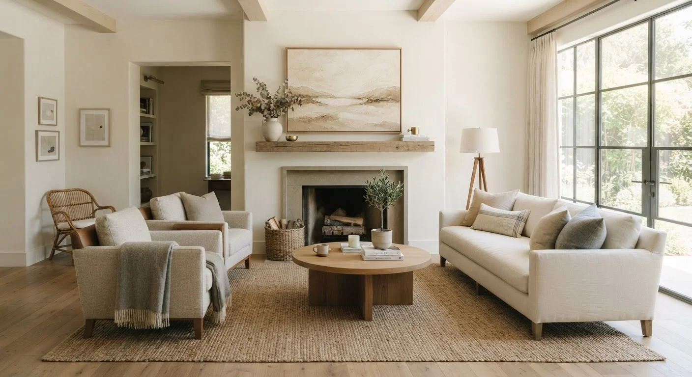
Photo credit: faqsnest.com
In this article
Balance, rhythm, proportion, and emphasis explained — the core principles that make any room feel intentional and cohesive.
Key Takeaways
- Balance distributes visual weight evenly so no area of a room feels heavier than another.
- Proportion and scale ensure that furniture and objects relate correctly to each other and the room's dimensions.
- Rhythm creates visual flow by repeating colors, shapes, or textures throughout a space.
- Emphasis gives a room a clear focal point that anchors everything around it.
- Unity ties all elements together so the room reads as a cohesive whole rather than a collection of unrelated objects.
Why Design Principles Matter More Than Style
Style — whether it's mid-century modern, farmhouse, or eclectic — is personal preference. But the principles underneath style are universal. A room can look like anything and still feel off if it lacks balance, proportion, or clarity of intent. Conversely, a thoughtfully arranged room with modest furnishings can feel polished and inviting.
These principles aren't rules to follow blindly. They're tools for diagnosing what's wrong when a room feels awkward, and for making confident choices when you're starting from scratch. Once you understand them, you'll start to see them operating in every space — well-designed or not. For a broader look at how these concepts interconnect, see fourteen design concepts worth understanding before you redecorate.
Balance: Distributing Visual Weight
Balance is perhaps the most instinctively felt of all design principles. Walk into an unbalanced room and something feels wrong even if you can't name it. Balance is about distributing visual weight — the perceived heaviness of objects based on their size, color, and texture — so no single area dominates.
There are three types of balance in interior design:
- Symmetrical balance mirrors one side of a room against the other. Two matching lamps flanking a sofa, or identical nightstands beside a bed, are classic examples. This approach reads as formal and orderly.
- Asymmetrical balance uses different objects of similar visual weight to create equilibrium. A large plant on one side of a mantle might balance a cluster of smaller framed prints on the other. This feels more relaxed and contemporary.
- Radial balance arranges elements around a central point — a round dining table with chairs, or a circular rug anchoring a seating area.
Most rooms benefit from a mix of symmetrical and asymmetrical balance. Pure symmetry can feel sterile; pure asymmetry can feel chaotic. The goal is visual equilibrium, not mathematical precision.
Asymmetry Doesn't Mean Random
Asymmetrical balance is frequently misunderstood as an excuse to place things without structure. In practice, it requires more deliberate thought than symmetry — each element must carry visual weight that counterbalances another. If a large, dark object sits on one side of a shelf, a cluster of smaller, lighter items on the other side can offset it. The result should feel dynamic, not haphazard.
Proportion, Scale, and Rhythm
Proportion refers to how the size of objects relates to each other and to the room itself. A sectional sofa in a small apartment living room violates proportion — not because sectionals are wrong, but because the scale relationship between furniture and space is off. The same sofa in a large open-plan room might be exactly right.
Scale is the specific size of an object relative to a standard reference. A common mistake is purchasing art or rugs that are too small for their intended wall or floor space. As a general reference, a rug in a living room should be large enough that the front legs of all major furniture pieces can rest on it — this grounds the seating area and makes the room feel cohesive.
Rhythm is what keeps the eye moving through a space. It's created by repeating elements — colors, shapes, textures, or patterns — at intervals. A deep blue that appears in a throw pillow, an accent vase, and a piece of artwork creates rhythm without being monotonous. Texture plays a significant role in creating rhythm too, often in ways that aren't immediately obvious.
Rhythm can also be created through contrast: alternating light and dark, smooth and rough, tall and low. The movement that results is what gives a well-designed room its energy.
Emphasis and Unity: The Finishing Framework
Emphasis means giving a room a clear focal point — the element that naturally draws the eye first. In many living rooms, the focal point is a fireplace or a large window with a view. In a bedroom, it's typically the bed's headboard wall. In a dining room, it's often an overhead light fixture or a statement piece of furniture.
When a room lacks emphasis, everything competes for attention and the result is visual noise. When a focal point exists, the rest of the room's arrangement can respond to it. Furniture faces it. Art reinforces it. Scale builds around it. For practical guidance on using focal points in layout decisions, see our furniture arrangement starting point.
Unity is the overall sense that a room's elements belong together. This doesn't mean everything has to match — it means elements share a common thread, whether that's a consistent color palette, a repeated material (such as brushed brass in hardware, lighting, and accessories), or a consistent style sensibility. Unity is what separates a curated room from a room that simply accumulated objects over time.
One practical test: stand at the entrance to any room and ask whether your eye is led naturally through the space, lands somewhere specific, and then reads the room as a whole. If yes, the core principles are working. If not, balance, proportion, emphasis, or unity is the likely culprit — and now you have the vocabulary to address it. See our room-by-room design checklist for a structured way to work through each space. And if something still feels off, common design myths may be worth reviewing too.
Frequently Asked Questions

Author
Home & Garden Editorial Team
Home & Garden Editorial Team is the collective byline for our editorial team and contributor network. Articles published under this byline or an editorial pen name are researched, written, and reviewed according to our editorial standards for clarity, consistency, and independence before publication.
View all articles →