
Texture in Interior Design: The Element Most People Overlook
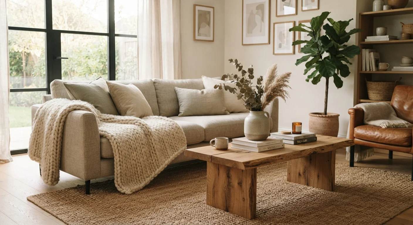
Photo credit: faqsnest.com
In this article
Colour and furniture get all the attention, but texture is what gives a room depth and warmth. Learn how to layer it well.
Key Takeaways
- Texture works on two levels: tactile (what you feel) and visual (what your eye perceives from a distance).
- Rooms with a single dominant texture tend to feel flat, regardless of how well the colour scheme is chosen.
- Layering three to five distinct textures is a reliable starting point for creating depth without visual chaos.
- Texture can be introduced at almost any budget through throws, cushions, rugs, and plants.
- Natural materials such as linen, jute, wood, and stone bring organic texture that feels grounded and timeless.
Why Texture Matters More Than You Think
Most people spend enormous energy choosing paint colours and hunting for the right sofa — then wonder why the finished room still feels a little lifeless. Often, the missing ingredient is texture. It's the design element that operates below conscious awareness, yet it's responsible for whether a space feels warm or cold, inviting or sterile.
Texture works in two distinct ways. Tactile texture is what you'd actually feel if you ran your hand across a surface — the nubby weave of a wool throw, the grain of an oak tabletop, the cool smoothness of a glazed ceramic lamp. Visual texture is what the eye reads from across the room: the play of light and shadow across a bouclé armchair, the depth in a patterned wallcovering, the roughness implied by a raw-edge shelf. Both types contribute to a room's character, and both can be strategically layered.
For a broader grounding in how texture fits alongside other foundational ideas, the fourteen design concepts worth understanding before you redecorate covers visual weight, negative space, and other principles that work in parallel.
How to Layer Textures Without Creating Chaos
Layering texture is not about piling in as many materials as possible — it's about deliberate contrast and balance. A useful starting point is to think in groups: soft textures (upholstery, rugs, curtains, cushions), hard textures (wood, stone, metal, ceramic), and natural textures (wicker, jute, linen, plants). A room that draws from all three groups tends to feel complete.
The ratio matters too. In most living spaces, soft textures anchor the room (a sofa, an area rug), hard textures provide structure and visual contrast (a coffee table, a mirror frame), and natural textures add warmth without heaviness (a woven basket, a terracotta pot, a low plant). Leaning too far in any direction tips the balance — all-soft reads as formless, all-hard reads as cold.
Texture also interacts with light, so a room's exposure should inform your choices. Matte, rough textures absorb light and make north-facing rooms feel warmer and more intimate. Smooth, reflective surfaces — polished stone, lacquered finishes, glass — bounce light and suit rooms that already have good natural brightness. The relationship between surface finish and light applies equally to walls and to furnishings.
Texture Across Different Design Styles
One of the practical strengths of texture is that it works within — and can actually define — almost any aesthetic. In a Scandinavian-influenced room, raw linen, pale birch, and simple wool are the primary textural language: understated, tactile, and quietly warm. In an industrial scheme, exposed brick, brushed metal, and worn leather do the heavy lifting. In more maximalist spaces, layered rugs, embroidered cushions, and mixed-material shelving create deliberate richness.
Understanding your style direction helps you choose textures that support rather than fight your existing decisions. The interior design styles decoded guide breaks down the material signatures of the most recognised styles, which can serve as a useful reference when curating a texture palette.
Texture also has a close relationship with pattern — they often occupy the same objects (think a geometric-weave cushion or a herringbone rug). When combining both, the general guidance is to let texture be the constant background and pattern the occasional accent, rather than competing equally. For more on managing that balance, decorating with pattern is a useful companion read.
Common Mistakes and How to Fix Them
The most common texture mistake is monotony: a room where every surface is smooth, every fabric flat-woven, every finish matte. It rarely reads as intentionally minimal — it typically reads as unfinished. The fix is as simple as adding one or two contrasting elements. A chunky-knit throw on a sleek sofa, a rattan side table in a room full of glass and chrome, a rough stone bookend among polished accessories — each introduces a counterpoint the eye can rest on.
A second mistake is texture overload in one zone. Stacking too many competing textures on a single surface — say, a coffee table covered in a rough tray, multiple woven objects, a shaggy plant, and a textured candle — produces visual noise rather than richness. Distribution across the room is more effective: vary the texture at floor level (rug), mid-level (upholstery, cushions, curtains), and eye level and above (art, shelving, lighting).
Finally, texture is sometimes treated as decorative afterthought when it can also solve functional problems. A large rug grounds a furniture arrangement and reduces echo in a hard-floored space. Heavy curtains add insulation and soften a window wall. Upholstered wall panels reduce noise. These are cases where texture and practicality converge — which is part of what makes it such a versatile design tool. See how furniture layout interacts with these decisions in our furniture arrangement guide.

Author
Home & Garden Editorial Team
Home & Garden Editorial Team is the collective byline for our editorial team and contributor network. Articles published under this byline or an editorial pen name are researched, written, and reviewed according to our editorial standards for clarity, consistency, and independence before publication.
View all articles →