
Decorating with Pattern: Where to Start and When to Stop
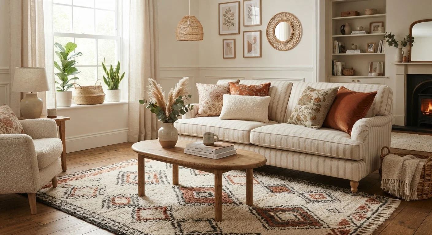
Photo credit: faqsnest.com
In this article
Mixing prints and patterns is one of the most intimidating parts of decorating. These guidelines make it far more approachable.
Key Takeaways
- Anchor any pattern mix with one dominant print, then build around it with smaller-scale supporting patterns.
- Shared color is the most reliable bridge between patterns that would otherwise clash.
- Varying pattern scale — large, medium, small — prevents visual competition between prints.
- Solid colors and textures give the eye necessary breathing room between busy patterns.
- Knowing when to stop is just as important as knowing which patterns to combine.
Why Pattern Intimidates — and Why It Doesn't Have To
Pattern is one of the most powerful tools in interior design, yet it's also one that many decorators — especially first-timers — avoid entirely out of fear of getting it wrong. The result is rooms that feel safe but flat. The good news: mixing patterns successfully isn't a matter of instinct or expensive taste. It follows a set of learnable principles.
Before you choose a single print, it helps to understand what makes patterns work together in the first place. Pattern combinations succeed when they share a visual language — a common color, a complementary scale, or a unifying style — that lets the eye move comfortably from one to the next. Without at least one of those anchors, patterns compete rather than converse. For a broader foundation on the principles that guide all design decisions, see design concepts worth understanding before you redecorate.
The Core Practices for Mixing Patterns Well
These guidelines apply whether you're working on a single accent chair or an entire open-plan living space. Apply them in sequence and they'll keep your choices grounded.
Choose one dominant pattern first and let everything else respond to it.
Without a clear lead pattern, a room can feel visually chaotic because multiple strong prints compete for attention. A dominant pattern sets the color palette, mood, and scale that all other choices should reference. This creates cohesion rather than coincidence.
Vary pattern scale deliberately — combine large, medium, and small prints.
When two patterns of identical scale appear together, they create visual noise because the eye can't prioritize either one. Deliberately mixing scales — a large floral, a medium check, a small ditsy print — gives each pattern its own visual territory.
Use a shared color to bridge patterns that differ in style or scale.
Shared color is the fastest way to make disparate patterns feel intentional. Even one common hue running through each print signals to the eye that the combination was deliberate. This works even when the patterns themselves belong to very different visual families.
Introduce solid colors and neutral textures as visual rest areas.
Every pattern mix needs breathing room — surfaces and areas where the eye can pause before moving to the next print. Without them, a room becomes exhausting to be in, even if each individual pattern is attractive on its own.
Keep pattern style loosely within the same design family.
Combining a formal damask with a casual graphic print can feel jarring because they carry different design languages — one traditional, one contemporary. Patterns within a similar style register (all organic, all geometric, all classic) tend to layer more naturally.
Test combinations at small scale before committing to large applications.
Pattern choices that look promising on a swatch or in a catalog image can read very differently at full scale in an actual room. Testing with removable or low-commitment pieces first saves costly mistakes.
Once you have a mix that feels balanced, the question shifts from what to add to when to stop. Overloading a room with pattern — even well-chosen pattern — erases the breathing room that makes each print readable. Solid colors and textural surfaces play a critical supporting role here. For more on how texture works alongside pattern to give a room depth, see how texture functions in interior design.
Room-by-Room Considerations
Not every room has the same tolerance for pattern. A few variables — room size, natural light, how long you spend in the space, and what the room is used for — all affect how much pattern is appropriate.
- Living rooms can typically support the most layering: a patterned sofa or rug as the anchor, throw pillows in complementary prints, and perhaps a patterned accent chair or curtain panel.
- Bedrooms benefit from a calmer approach. Patterned bedding paired with solid walls and one or two accent prints usually creates enough visual interest without disrupting restfulness.
- Small rooms can use pattern, but restraint is more important. A bold wallpaper on one wall with solid furnishings is often more effective than several competing prints in a tight space.
- Kitchens and bathrooms often do best with pattern introduced through tile, a single textile, or small accessories rather than multiple layers.
If you're working through a full redesign and want a structured approach by room, the room-by-room design checklist offers a methodical framework to follow.
The Two-Pattern Starting Point
If layering multiple patterns feels overwhelming, start with just two: one large-scale and one small-scale, both sharing at least one color. This pairing alone creates clear visual interest without the complexity of managing three or more prints simultaneously. Once that combination feels comfortable, you can decide whether the room needs anything more — and often, it won't.
Quick Actions to Get Started Today
You don't need to redesign an entire room to start practicing pattern mixing. These entry points let you test combinations at low commitment before scaling up.
Pattern is most successful when it serves the room's overall character rather than demanding attention for its own sake. A bold statement print can anchor a room beautifully — or overwhelm it. If you're considering a single standout piece as the pattern centerpiece, it's worth reviewing when a statement piece works against you before committing. And when your pattern choices are settled, furniture arrangement fundamentals will help you position everything to its best advantage.

Author
Home & Garden Editorial Team
Home & Garden Editorial Team is the collective byline for our editorial team and contributor network. Articles published under this byline or an editorial pen name are researched, written, and reviewed according to our editorial standards for clarity, consistency, and independence before publication.
View all articles →