
Small Living Room, Big Presence: Spatial Tricks That Actually Work
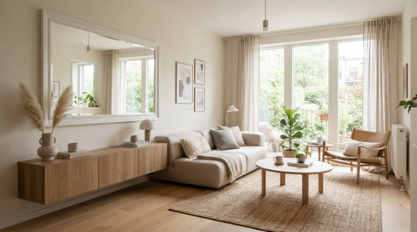
Photo credit: faqsnest.com
In this article
Discover layout strategies, furniture choices, and visual techniques that make compact living rooms feel open and well-designed.
Key Takeaways
- Furniture scale matters more than quantity — fewer, right-sized pieces open a room significantly.
- Strategic mirror placement and layered lighting can visually double perceived space.
- Vertical space is underused in most small rooms — drawing the eye upward adds height.
- A consistent, limited color palette reduces visual clutter and makes rooms feel larger.
- Multi-functional furniture and hidden storage are essential in compact living areas.
Why Small Rooms Feel Cramped (And It's Not Just the Square Footage)
Most compact living rooms don't feel small because of their footprint — they feel small because of how they're arranged. Oversized sofas pushed against every wall, furniture at mismatched scales, and a lack of clear sightlines all contribute to a sense of crowding that has little to do with actual dimensions.
Understanding the visual mechanics at play is the first step. A room feels open when the eye can travel — across a clear floor plane, up toward the ceiling, or through a space to a light source. Anything that interrupts that travel, whether it's a bulky coffee table, low-hanging artwork, or a dark wall, shortens the perceived room. The fixes are more about composition than renovation.
For a thorough grounding in how layout, scale, and color interact, our end-to-end interior design guide walks through each principle in depth. If you're starting from scratch with furniture placement, this layout guide covers the core decisions around traffic flow and focal points.
What You'll Need
Before rearranging or making any changes, gather a few simple tools and information:
What you will need
Measuring tape
Accurately measure room dimensions and furniture footprints before rearranging or purchasing.
Graph paper or a free room-planning app
Sketch furniture layouts to scale before physically moving anything.
Full-length or large wall mirror
Reflect light and visually expand the perceived depth of the room.
Command strips or wall anchors
Hang shelving or mirrors without causing unnecessary wall damage.
Step-by-Step: Spatial Techniques That Make a Difference
These steps are ordered by impact and ease. Work through them sequentially or focus on the ones most relevant to your current layout.
Map the Room to Scale Before Moving Anything
Use graph paper or a free digital room planner to draw your space accurately. Mark doors, windows, and any fixed elements like radiators or outlets. Then sketch your existing furniture at scale and try at least two alternative arrangements on paper before touching anything in the room.
This single step prevents the most common mistake: moving heavy furniture repeatedly based on guesswork.
Right-Size Your Furniture
Audit every piece currently in the room. A sofa that seats five in a room designed for three is consuming space nobody uses. Swap for pieces that match actual usage: a loveseat plus one accent chair often provides the same seating capacity with better spatial flow.
Look for furniture with legs rather than pieces that sit flush to the floor — visible floor space underneath creates the impression of a larger room. Glass or open-frame side tables achieve a similar effect.
Create a Clear Focal Point and Arrange Around It
Every well-composed living room has one primary anchor: a fireplace, a large window, a media wall, or a significant piece of art. Identify yours, then arrange seating to face it. This creates a natural conversation zone and keeps the layout purposeful rather than scattered.
Avoid pushing all furniture against the walls in an attempt to "save space" — a slightly inward grouping with breathing room around the edges actually makes the room feel larger and more intentional.
Use Mirrors to Extend the Room Visually
A large mirror on the wall opposite a window reflects both light and the view, effectively doubling the perceived depth of the space. Position it so it captures a meaningful reflection — ideally light, greenery, or an attractive part of the room — rather than reflecting a blank wall or clutter.
Gallery-style arrangements of smaller mirrors work too, but a single large mirror typically reads as more intentional and spacious than a cluster of small ones.
Maximize Vertical Space
Install shelving above eye level, hang curtains as close to the ceiling as possible (even if windows are lower), and choose tall, slim storage over wide, low pieces. Each of these moves draws the eye upward, making the ceiling feel higher and the room feel more expansive overall.
Floor-to-ceiling bookshelves or open shelving units are among the most effective tools in a small room — they provide storage without consuming much floor space.
Control Clutter With Dedicated Storage
Surface clutter is one of the fastest ways to shrink a room visually. Identify the items that consistently accumulate — remotes, chargers, books, blankets — and assign each a specific hidden or contained home. Baskets, lidded boxes, and ottomans with interior compartments all work well.
The goal isn't minimalism for its own sake; it's reducing the number of visual interruptions the eye encounters as it moves around the room.
Color, Pattern, and Light: The Finishing Layer
Once the furniture layout is resolved, color and lighting do the heavy visual lifting. A consistent palette of two to three tones — with one dominant neutral — reduces visual noise dramatically. This doesn't mean the room must be beige; it means that contrast should be intentional rather than accidental.
Paint is one of the highest-impact, lowest-cost changes available. Contrary to common belief, dark paint doesn't always shrink a room — it can create depth when used on a single accent wall or ceiling. For a full breakdown of color myths, this article on design myths separates what actually works from received wisdom.
Lighting layers matter just as much. Overhead fixtures alone create a flat, compressed feeling. Adding floor lamps, table lamps, and any source that bounces light off walls or ceilings introduces depth. Natural light should be maximized: keep window treatments light in color and weight, and avoid furniture that blocks sill height.
Layer Your Lighting for Depth
Relying solely on a central overhead fixture is one of the most common lighting mistakes in small rooms. Add at least one floor lamp and one table lamp to create pools of light at different heights. This layering adds warmth, depth, and the impression of a more generous space — especially in the evening.
If your living room connects to a dining area or kitchen, this guide on open-plan versus zoned layouts can help you decide whether to visually unify or define those areas — each approach changes how spacious the combined space feels.
Common Mistakes to Avoid
A few recurring errors consistently undercut small living room efforts:
- Too many statement pieces: One anchor item — a rug, a sofa, a piece of art — gives the room a focal point. Multiple competing focal points fragment attention and make a space feel chaotic. Learn when a statement piece works against you before committing to a bold purchase.
- Floating furniture without purpose: Pulling sofas away from walls is good advice, but only if there's enough floor clearance to justify it. In very small rooms, a slightly wall-adjacent arrangement may work better.
- Ignoring vertical space: Most people decorate to eye level and stop. Shelves, tall bookcases, and ceiling-height curtains all draw the eye upward and make ceilings feel taller.
- Rugs that are too small: An undersized rug makes a seating area look adrift. Front legs of sofas and chairs should rest on the rug to anchor the grouping.
Renters navigating these challenges with limited ability to paint or install fixtures will find practical options in this guide to renter-friendly design.

Author
Home & Garden Editorial Team
Home & Garden Editorial Team is the collective byline for our editorial team and contributor network. Articles published under this byline or an editorial pen name are researched, written, and reviewed according to our editorial standards for clarity, consistency, and independence before publication.
View all articles →