
Interior Design End to End: From Empty Room to Finished Space
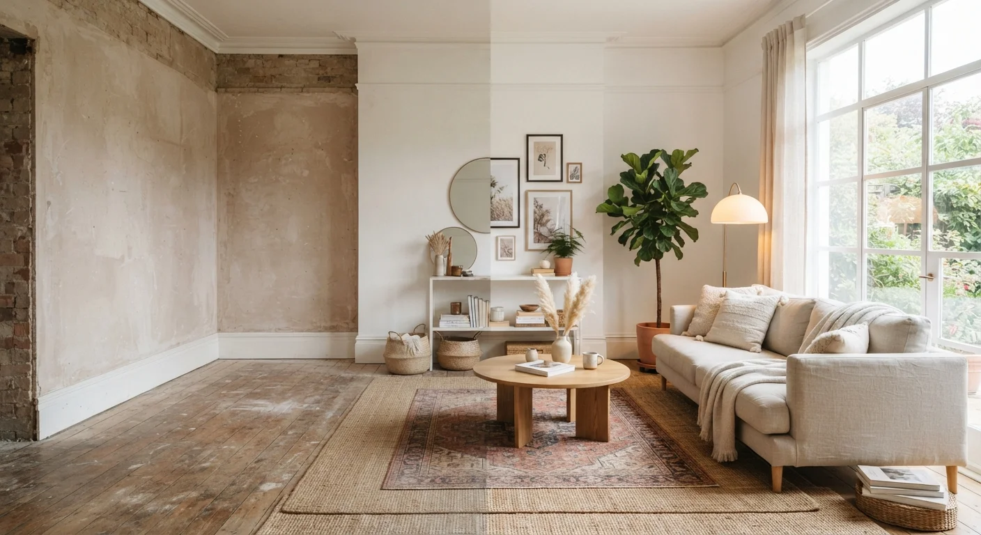
Photo credit: faqsnest.com
In this article
A comprehensive guide covering design principles, colour theory, layout, lighting, furniture, and finishing touches — all in one place.
Key Takeaways
- A written design brief prevents costly impulse decisions and keeps the project focused.
- Colour, layout, lighting, and furniture must work as a system — not as independent choices.
- Scale and proportion determine whether a room feels balanced or awkward.
- Layered lighting creates both function and atmosphere far more effectively than a single overhead fixture.
- Finishing touches applied last — textiles, art, plants — unify the room and express personality.
- Any room, at any budget, benefits from following the same sequence of design decisions.
Start with a Clear Design Brief
Before selecting a single paint swatch or piece of furniture, take time to define what the room actually needs to do. A design brief — even a simple written list — answers three questions: who uses the room, how they use it, and what it needs to feel like. A home office shared by two people has very different requirements than a guest bedroom used a few times a year.
Collect visual references from magazines, social media, or design sites and look for recurring patterns. Do you keep saving rooms with warm wood tones and linen textures? That reveals something about your instincts. See our visual reference guide to interior design styles to identify the vocabulary for what you're drawn to.
Also set a realistic budget range at this stage. Costs should guide decisions about where to invest (a quality sofa frame, solid-wood flooring) versus where to save (decorative accessories, seasonal textiles). For a broader view of scoping and budgeting a home project, the home improvement planning guide covers that ground thoroughly.
Understanding Colour Theory for Interiors
Colour is the most emotionally immediate design tool you have, and understanding a few foundational principles prevents mismatched rooms. Start with the colour wheel: analogous palettes (colours sitting adjacent on the wheel, like blue, blue-green, and green) feel harmonious and calm. Complementary palettes (colours opposite each other, like terracotta and teal) create energy and contrast.
A reliable starting framework is the 60-30-10 rule: 60% of the room in a dominant colour (usually walls and large furniture), 30% in a secondary colour (upholstery, curtains), and 10% in an accent (cushions, art, objects). This ratio creates visual balance without making the space feel monotonous.
Lighting dramatically shifts how a paint colour reads — a warm-toned white can appear yellow under incandescent light and grey-blue under daylight. Always test paint samples in the actual room at different times of day before committing. Undertones (the subtle warm or cool bias within a neutral) are frequently the reason a colour that looked perfect in-store feels wrong at home.
Sample paint directly on the wall in a large swatch (at least 12×12 inches) and live with it for 48 hours before deciding. Colour cards held in hand bear little resemblance to full walls under variable lighting.
Small samples viewed in artificial light or against a white card fail to account for how the colour interacts with the room's natural light, flooring, and adjacent tones — the conditions that actually matter.
When building a gallery wall, cut paper templates of each frame and tape them to the wall first. Rearrange freely until the composition feels balanced before committing to a single nail hole.
Gallery walls are one of the most common sources of unnecessary wall damage from repeated repositioning — planning on paper first saves both the wall and the frustration.
For any new room layout, use blue painter's tape on the floor to mark the footprint of furniture before purchasing. This reveals whether scale and traffic flow actually work in the real space.
Floor plans drawn to scale help, but standing in a taped-out space at real life size is the most reliable way to judge whether a piece will feel proportionate and leave adequate clearance.
Layout and Furniture Arrangement
Layout is the skeleton of the room — get it wrong and no amount of decorating will compensate. Start by identifying the room's focal point: an architectural feature like a fireplace or large window, or a dominant piece like a media unit or bed. Arrange furniture to acknowledge and anchor that focal point rather than compete with it.
Map out traffic flow before moving anything. Main pathways through the room should be at least 36 inches wide; the space between a sofa and a coffee table should be 14–18 inches for comfortable use. In living areas, seating arranged conversationally — facing each other rather than all aimed at a single screen — tends to produce more livable, flexible rooms.
Our furniture arrangement guide walks through these core decisions in detail. Scale matters enormously: a large sectional in a small room will always feel oppressive, while too-small furniture in a generous space reads as tentative and unfinished. Draw a simple floor plan to scale before purchasing anything substantial.
Lighting: The Layer That Ties Everything Together
Most rooms rely on a single overhead fixture — and most rooms feel flat as a result. Professional designers think in three layers of light: ambient (general illumination), task (focused light for specific activities like reading or cooking), and accent (light used to highlight art, architecture, or objects). A room with all three layers feels dimensional and adaptable.
Dimmers are one of the highest-value investments in any room because they allow a single fixture to serve multiple moods. Floor lamps and table lamps bring light down to human level, making spaces feel more intimate than ceiling-only illumination. In rooms without natural light, warm-toned bulbs (around 2700K–3000K) compensate more effectively than bright cool-white sources, which can feel clinical.
Consider the color rendering index (CRI) of bulbs — a CRI of 90 or above means colours in the room appear truer to how they look in daylight, which matters especially when you've carefully chosen a paint palette.
Choosing and Placing Furniture
Furniture selection is where budget tension is most acute. A practical principle: invest in pieces that are used constantly and structurally demanding — sofas, bed frames, dining tables — and approach decorative or trend-led pieces with more flexibility. A well-made sofa frame can outlast many rounds of cushion and upholstery updates.
When selecting pieces, apply the core design principles — balance, proportion, rhythm, and emphasis — to every decision. A room that mixes all different furniture heights, leg styles, and finishes without intention reads as chaotic. Repeating one element (a metal finish in the lamp, side table legs, and curtain rod) creates cohesion without requiring matched sets. The design principles every room should follow provides a deeper breakdown of these concepts.
Leave breathing room around furniture. Rooms that are overfurnished — even with beautiful pieces — feel cramped and anxious. If in doubt, remove rather than add.
Finishing Touches: Textiles, Art, and Accessories
Textiles do more work per dollar than almost any other element: rugs define zones within open-plan spaces, curtains hung high and wide make windows appear larger, and layered cushions introduce colour and texture without structural commitment. As a rule, mix at least three scales of pattern and texture in any textile grouping — large, medium, and small — to avoid visual flatness.
Art placement follows a simple rule: hang pieces so the visual center sits at roughly eye level (around 57–60 inches from the floor), not the top of the frame. Gallery walls work best when planned on paper or tape-mapped on the wall before any nails go in. Use an odd number of objects in a vignette — three or five — as this tends to feel more natural and dynamic than even groupings.
Plants add life, scale, and a connection to the natural world that no manufactured object replicates. Even a single well-placed large-leafed plant can make a corner that previously felt empty feel resolved. Use our room-by-room design checklist to ensure no detail gets overlooked as you work through each space.
Putting It All Together
The most important thing to understand about interior design is that it is a sequence, not a collection of independent choices. Colour influences furniture selection. Layout determines where lighting goes. Lighting changes how colour reads. Finishing touches only land correctly when the structural decisions beneath them are sound.
Work through the room in order: brief and budget → style direction → layout → lighting plan → furniture selection → colour → accessories. Resist the temptation to skip ahead. Buying art before you've committed to a colour palette, or choosing a rug before finalizing the furniture layout, leads to expensive backtracking.
The good news is that the principles are consistent regardless of budget. A modest room planned with intention and restraint will almost always outperform an expensive room assembled without a coherent strategy. For a comprehensive overview of home improvement projects that complement a design refresh, explore the full hub for guidance on sequencing structural and decorative work together.

Author
Home & Garden Editorial Team
Home & Garden Editorial Team is the collective byline for our editorial team and contributor network. Articles published under this byline or an editorial pen name are researched, written, and reviewed according to our editorial standards for clarity, consistency, and independence before publication.
View all articles →