
Warm Tones vs. Cool Tones: Choosing a Colour Direction for Your Home
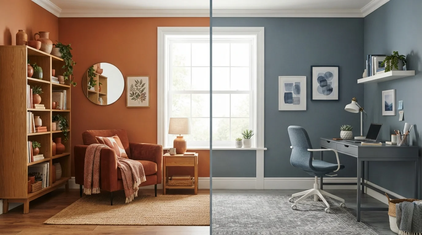
Photo credit: faqsnest.com
In this article
Not sure whether to go warm or cool with your palette? Here's how each direction affects mood, light, and room character.
Key Takeaways
- Warm tones (reds, oranges, yellows, warm browns) advance visually, making spaces feel smaller and more intimate.
- Cool tones (blues, greens, greys, purples) recede visually, lending rooms a sense of openness and calm.
- Your room's existing light — natural and artificial — should be assessed before committing to either direction.
- Most successful interiors blend both: a dominant palette with accents from the opposite temperature.
- Undertones in neutrals matter; a beige can lean warm or cool depending on its base pigment.
- Paint a large sample swatch and observe it across morning, afternoon, and evening light before deciding.
What Colour Temperature Actually Means
Colour temperature in interior design refers to the perceived warmth or coolness of a hue based on its position on the colour wheel and its underlying pigment mix. Warm tones sit on the red-orange-yellow arc — think terracotta, burnt sienna, mustard, and camel. Cool tones occupy the blue-green-violet arc — slate blue, sage, charcoal, and lavender are typical examples.
But temperature isn't absolute. A colour's warmth or coolness can shift depending on what surrounds it. A mid-grey next to a warm cream will read cool; place that same grey beside cobalt blue and it suddenly appears warm by comparison. This is why understanding undertones matters as much as choosing the dominant hue.
Neutrals are where undertone confusion is most common. Many homeowners pick what looks like a crisp white in a paint strip, only to find it reads decidedly yellow or pink on the wall. Identifying whether your neutral leans warm (yellow, peach, red base) or cool (blue, green, grey base) is essential before committing to a direction. Paint finish also plays a role in how a colour reads under different light conditions — worth considering alongside tone.
How Each Direction Affects a Room
Warm tones are said to advance — a design principle describing how certain colours appear to move toward the viewer. In practice, this means warm-painted walls seem closer together, giving a large or boxy room a sense of enclosure and intimacy. This quality is ideal for a dining room where you want guests to feel gathered, or a bedroom that should feel like a retreat.
Cool tones recede. They push walls visually outward, lending a sense of airiness and space. A narrow hallway painted in soft blue-grey will feel noticeably less cramped than the same hallway in a deep terracotta. Bathrooms and small studies benefit particularly from this optical effect.
Mood is the other significant variable. Research in environmental psychology suggests that warm hues tend to elevate energy and stimulate social engagement, while cool hues are associated with relaxation and reduced mental arousal. Neither is better — each suits different rooms and different people. The relevant question is how you want to feel when you spend time in that space.
| Criterion | Warm Tones | Cool Tones |
|---|---|---|
| Visual effect on space | Makes rooms feel smaller, cosier | Makes rooms feel larger, airier |
| Mood association | Energising, social, comforting | Calming, focused, serene |
| Best room types | Living rooms, dining rooms, bedrooms | Offices, bathrooms, open-plan spaces |
| Works best with light | North-facing or low-light rooms | South-facing or bright rooms |
| Risk if overdone | Can feel heavy or claustrophobic | Can feel cold or clinical |
| Neutral examples | Greige, warm white, cream, camel | Cool white, slate, dove grey, putty |
Lighting conditions interact closely with palette. A north-facing room (which receives indirect, cooler daylight in the Northern Hemisphere) handled with cool tones can tip into feeling cold or flat. In that context, warm tones are often the more practical choice regardless of personal preference.
Layering Tones and Avoiding Common Mistakes
Few well-designed interiors are entirely one temperature. A room dominated by warm ochre walls might carry linen cushions in dusty sage, or a cool grey scheme might rest on a jute rug that anchors the space in warmth. These contrasting accents prevent a palette from tipping into monotony or becoming visually fatiguing.
A practical principle: choose your dominant temperature (roughly 60–70% of the visual field) and let the opposing temperature serve as accent and relief. This applies to wall colour, large furniture upholstery, flooring, and soft furnishings collectively — not wall colour alone.
Texture works alongside tone to modulate how warm or cool a space feels. Rough, natural materials — linen, raw wood, stone — carry an inherent warmth regardless of their colour. Smooth, reflective surfaces — polished concrete, lacquered cabinetry, glass — tend to read cool. A room with warm-toned walls but entirely smooth surfaces can still feel sterile; introducing textural variety is often the fix.
One of the most common mistakes is deciding on a palette based solely on a small paint chip in store lighting. Paint a sample of at least 12 inches square directly on the wall, then observe it in morning light, afternoon light, and under your artificial bulbs in the evening. LED bulbs with a warm white rating (around 2700K) will push colours warmer; daylight-balanced bulbs (5000K+) will reveal cooler undertones. A monochromatic scheme can work beautifully in either temperature — but lighting assessment becomes even more critical when working with a single hue throughout.

Author
Home & Garden Editorial Team
Home & Garden Editorial Team is the collective byline for our editorial team and contributor network. Articles published under this byline or an editorial pen name are researched, written, and reviewed according to our editorial standards for clarity, consistency, and independence before publication.
View all articles →