
The Case For and Against a Monochromatic Interior
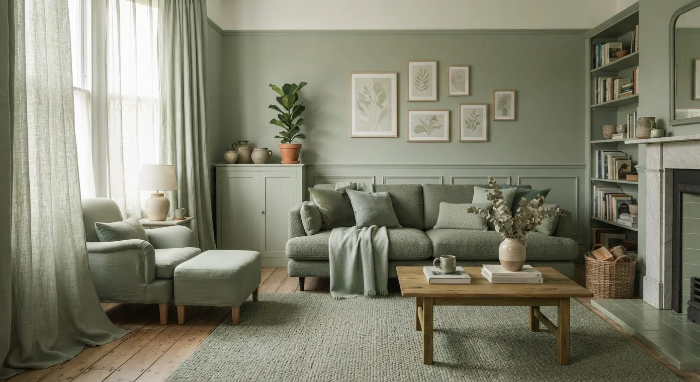
Photo credit: faqsnest.com
In this article
A single-colour scheme can feel serene and sophisticated — or flat and clinical. Here's an honest look at both outcomes.
Key Takeaways
- Monochromatic interiors use one base colour across multiple tones, tints, and shades — not a single flat paint.
- The approach creates strong visual cohesion but requires deliberate texture and pattern to avoid feeling flat.
- Lighting conditions significantly affect how a single-colour scheme reads throughout the day.
- Warm hues tend to feel more forgiving in monochromatic schemes than cool or neutral ones.
- The style suits minimalist personalities but can feel restrictive for those who redecorate frequently.
Creates immediate visual cohesion throughout a space
A shared colour family ties disparate furniture pieces and materials together, making a room feel intentional even when items were acquired separately. This is particularly useful in rental spaces where you can't control architectural details.
Simplifies purchasing and decorating decisions
Working within one colour family narrows the field of compatible choices, reducing the risk of costly mismatches. Shoppers can focus on shape, texture, and scale rather than juggling multiple palette constraints.
Makes rooms appear larger and more continuous
When walls, upholstery, and soft furnishings share a tonal family, the eye doesn't stop at boundaries — the space reads as a single, uninterrupted volume, which is especially effective in narrow or awkwardly shaped rooms.
Ages gracefully without trendy accent colours
A tonal palette anchored to a classic hue — soft grey, warm white, earthy green — tends to outlast colour-blocked or high-contrast schemes that date quickly as trends shift.
Amplifies the impact of texture and material choices
When colour isn't doing the heavy lifting, the quality and variety of materials become the focal point. This tends to push decorating in a more considered, craftsmanlike direction.
Can feel flat or lifeless without deliberate texture variation
Without the visual punctuation that contrasting colours provide, rooms depend entirely on surface variation for energy. In practice, this demands more investment in quality materials and thoughtful layering than most initial budgets allow.
Highly sensitive to changes in natural and artificial light
A single hue reads differently at different times of day and under different bulb temperatures, meaning a palette chosen under showroom lighting may feel wrong in your actual space. North-facing rooms with limited light are particularly unforgiving.
Difficult to refresh without a full overhaul
Because every element belongs to the same colour story, swapping one component — say, a sofa — often means rethinking the whole palette. This reduces the flexibility that makes decorating evolve naturally over time.
Risks feeling clinical or institutional in cooler hues
Pale blue-greys, stark whites, and cool greens can drift toward sterile or office-like territory if not balanced with warm-toned wood, natural fibre textiles, or adequate ambient lighting.
Limits opportunities to incorporate sentimental or mismatched pieces
Inherited furniture, travel souvenirs, and one-of-a-kind art rarely fit a strict colour family. A monochromatic commitment can mean sidelining meaningful objects in favour of palette consistency.
What Monochromatic Actually Means
The word monochromatic is often misread as "one colour, repeated identically everywhere." In practice, a well-constructed monochromatic scheme draws from the full tonal family of a single hue — its tints (the colour mixed with white), its shades (mixed with black or grey), and its tones (desaturated versions). A navy bedroom, for instance, might pair deep indigo walls with a powder-blue bedspread, slate-grey upholstered headboard, and cream-white woodwork — technically all descendants of blue.
Understanding this range is foundational. Before committing to the approach, it helps to revisit concepts like tonal contrast and visual weight, which determine whether a monochromatic room feels composed or flat. The scheme is about family resemblance, not uniformity.
The Case For Going Monochromatic
A single-colour palette offers structural advantages that multi-colour schemes have to work harder to achieve.
Creates immediate visual cohesion throughout a space
A shared colour family ties disparate furniture pieces and materials together, making a room feel intentional even when items were acquired separately. This is particularly useful in rental spaces where you can't control architectural details.
Simplifies purchasing and decorating decisions
Working within one colour family narrows the field of compatible choices, reducing the risk of costly mismatches. Shoppers can focus on shape, texture, and scale rather than juggling multiple palette constraints.
Makes rooms appear larger and more continuous
When walls, upholstery, and soft furnishings share a tonal family, the eye doesn't stop at boundaries — the space reads as a single, uninterrupted volume, which is especially effective in narrow or awkwardly shaped rooms.
Ages gracefully without trendy accent colours
A tonal palette anchored to a classic hue — soft grey, warm white, earthy green — tends to outlast colour-blocked or high-contrast schemes that date quickly as trends shift.
Amplifies the impact of texture and material choices
When colour isn't doing the heavy lifting, the quality and variety of materials become the focal point. This tends to push decorating in a more considered, craftsmanlike direction.
Perhaps the most underappreciated benefit is decision fatigue reduction. When every purchase — a throw pillow, a side table, a piece of wall art — only needs to answer the question "does this fit within my colour family?" rather than "does this match three existing colours?", decorating becomes more intuitive. Rooms also tend to age more gracefully; without a trendy accent colour tying the whole scheme together, there's less to replace when tastes shift. For a deeper look at how colour direction shapes mood, see our guide on choosing warm versus cool tones.
The Case Against Going Monochromatic
For all its elegance, the monochromatic approach carries real risks — many of which only surface after the paint has dried.
Can feel flat or lifeless without deliberate texture variation
Without the visual punctuation that contrasting colours provide, rooms depend entirely on surface variation for energy. In practice, this demands more investment in quality materials and thoughtful layering than most initial budgets allow.
Highly sensitive to changes in natural and artificial light
A single hue reads differently at different times of day and under different bulb temperatures, meaning a palette chosen under showroom lighting may feel wrong in your actual space. North-facing rooms with limited light are particularly unforgiving.
Difficult to refresh without a full overhaul
Because every element belongs to the same colour story, swapping one component — say, a sofa — often means rethinking the whole palette. This reduces the flexibility that makes decorating evolve naturally over time.
Risks feeling clinical or institutional in cooler hues
Pale blue-greys, stark whites, and cool greens can drift toward sterile or office-like territory if not balanced with warm-toned wood, natural fibre textiles, or adequate ambient lighting.
Limits opportunities to incorporate sentimental or mismatched pieces
Inherited furniture, travel souvenirs, and one-of-a-kind art rarely fit a strict colour family. A monochromatic commitment can mean sidelining meaningful objects in favour of palette consistency.
The scheme also imposes a kind of decorating discipline that not everyone finds sustainable. If you enjoy collecting objects, rotating accent colours seasonally, or bringing in bold finds from travels or thrift stores, a tight monochromatic palette can feel like a constraint rather than a framework. It works best for people who genuinely love — not just like — their chosen hue. Before committing, consider whether you might be better served by the intentional variety described in foundational design principles that allow controlled contrast.
Where It Tends to Succeed — and Struggle
Monochromatic schemes perform unevenly depending on the room type and hue chosen.
Where it works well: Bedrooms and bathrooms — spaces associated with calm and retreat — absorb single-colour logic naturally. Cool greens and muted blues in a bathroom create a spa-like continuity; terracotta or blush tones in a bedroom feel enveloping without being overwhelming. Hallways and staircases, which have little furniture to vary the composition, also benefit from a unified colour story that reads as intentional rather than sparse.
Where it struggles: Open-plan living and dining areas present the biggest challenge. These multi-function spaces rely on visual cues to signal transitions — from cooking to eating to lounging — and a single palette can blur those boundaries in ways that feel disorienting rather than seamless. Home offices risk feeling either overstimulating (if the hue is saturated) or drowsy (if it's too pale).
Monochromatic vs. Tonal: A Quick Distinction
Designers sometimes use "monochromatic" and "tonal" interchangeably, but there's a useful nuance. A strictly monochromatic scheme stays within one hue family (blues only, greens only). A tonal scheme prioritises matched saturation and brightness across different hues — think a muted sage, dusty blush, and warm stone used together. Both create cohesion, but the tonal approach allows slightly more colour variety while preserving the same unified, low-contrast effect.
It's also worth noting that the monochromatic approach is essentially the inverse of leaning on a statement piece to carry a room. If you've ever struggled with a bold centrepiece that overpowers everything around it, the single-colour strategy can actually solve that problem — or create a new version of it, as explored in our piece on when statement pieces work against a room.
Making the Approach Work in Practice
If the pros outweigh the cons for your situation, execution matters enormously. Three practical principles help monochromatic rooms avoid the pitfalls:
- Prioritise textural contrast over tonal contrast. Where colour doesn't vary dramatically, materials must: matte plaster beside glossy ceramic, nubby wool against smooth linen, raw wood alongside lacquered surfaces. Texture is what gives the eye somewhere to travel.
- Test the hue across all light conditions. A soft terracotta that reads warm and welcoming in afternoon light can turn muddy by morning or under overhead LEDs. Live with large paint samples across multiple days before committing.
- Anchor with a neutral. White woodwork, natural wood flooring, or concrete-effect tiles provide visual breathing room without introducing a second colour. These near-neutrals prevent the scheme from feeling sealed-in while preserving the palette's coherence.
Avoiding common misconceptions — like the myth that a single colour automatically makes a small room feel larger — is part of getting this right. For a useful reality check, see design myths that keep rooms looking off.

Author
Home & Garden Editorial Team
Home & Garden Editorial Team is the collective byline for our editorial team and contributor network. Articles published under this byline or an editorial pen name are researched, written, and reviewed according to our editorial standards for clarity, consistency, and independence before publication.
View all articles →